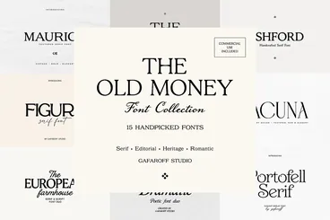
Luxury Serif Fonts
For a fragrance label, an editorial cover or a boutique identity, choose the serif in the context where it will be seen. The spacing and weight you need on a small label can differ from what works across a magazine cover.
Fonts to explore
All collections

Start with the actual wordmark
Set the full brand name in uppercase and title case. Compare spacing around round letters and diagonals, then judge the mark at both packaging and storefront size.
Keep the small type readable
Use the high-contrast serif for the main title. For small ingredients, captions and addresses, test a simpler companion with sturdier strokes.
Compare faces on the same layout
Use the same words, size and margins when comparing specimens. Changing one variable at a time makes it easier to judge proportions and rhythm.